


New visual identity and corporate website
We presented Taha Group and its pharmaceutical company, Taha Healthcare, with a comprehensive proposal for their presence. The square-Kufic direction was adopted as the new visual identity, and we are now building a single website for the group and Taha Healthcare around it.
- Client
- Taha Group & Taha Healthcare
- Date
- 2026
- Services
- Brand & Design, Websites & Systems, Business Development
- Status
- In progress
What we did
We made the company’s own name its mark, drawn in square Kufic on a single geometric grid. Arabic readers read it as a name; others remember it as a distinctive shape. In the Taha Healthcare mark, the space inside the letter ha becomes a plus sign.
Execution
A 43-page brand guide covering the mark’s construction, lockups, colours, typeface and supporting elements, its use on print, uniforms, delivery vans, shipping, warehouses and digital channels, a transition plan from the previous mark, and a logo animation with a sound signature.
Logo animation
From the project
More work

Taha Group
Infertility management symposium: organization and media
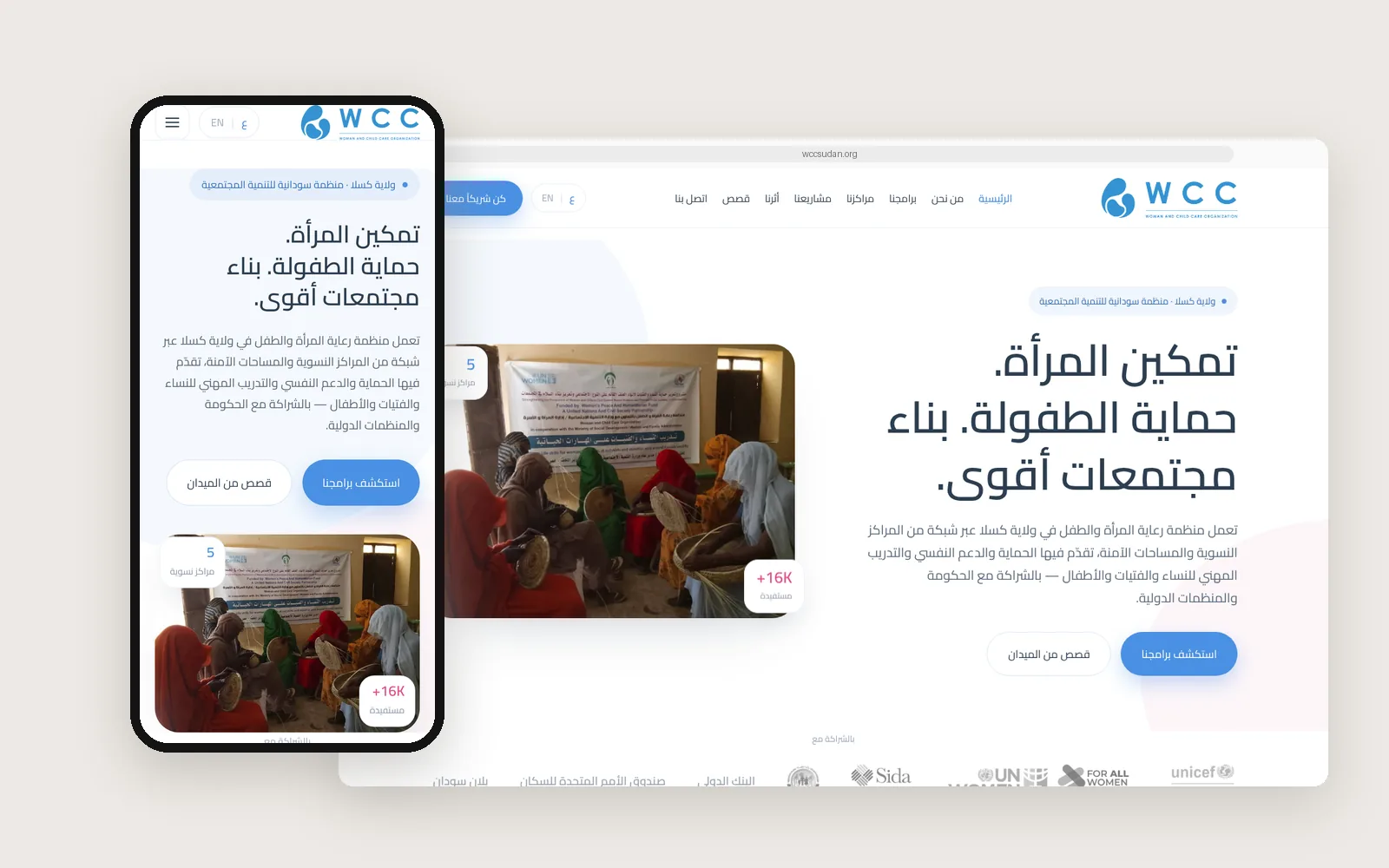
Woman and Child Care Organization (WCC)
Website, the “Sanaat Al-Athar” series and the “Peace Starts With Us” campaign
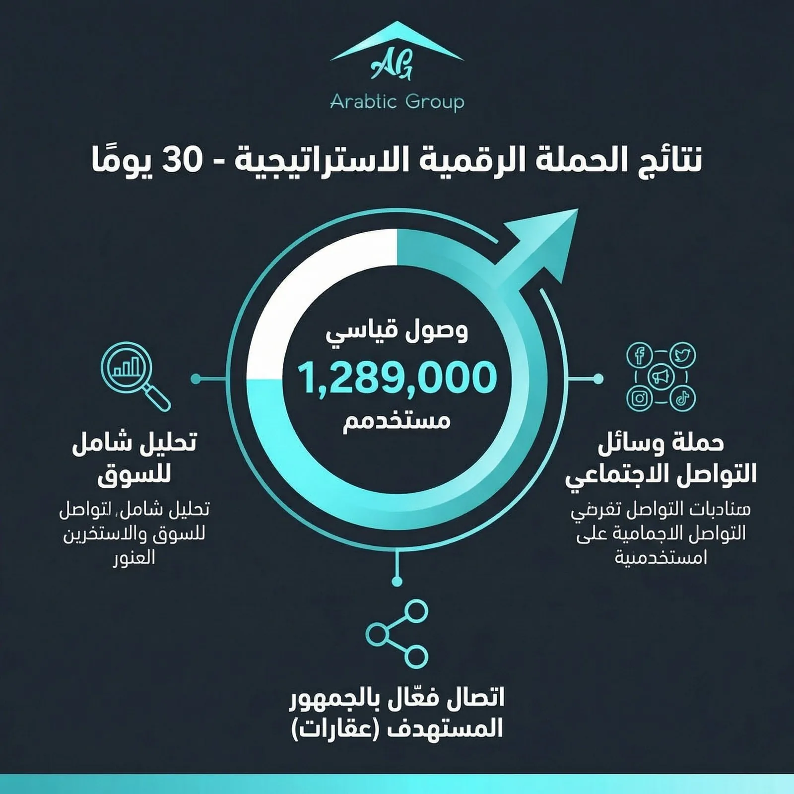
Arabtic Real Estate Group
Market study and digital campaign for real estate